
Project scope
Role
Lead UI/UX Designer
Client
Newlogic
About the client
Newlogic is a full-service digital agency delivering custom digital solutions across web, e-commerce, branding, and complex systems. Working on a wide range of bespoke projects exposed the need for stronger consistency, faster workflows, and scalable design practices — which ultimately became the foundation for building an internal design system and UI kit.
The Challenge
The design system and UI kit were created to address growing inconsistencies in core UI components and slow, repetitive design workflows across projects. Elements lacked scalability, designers repeatedly rebuilt common components from scratch, and fully custom development limited the agency’s ability to deliver smaller, fast-turnaround projects.
By building a unified design system and UI kit, we would be able to establish consistency, accelerate design processes, and unlock the ability to deliver leaner projects directly through Figma Sites — expanding both efficiency and business opportunities.

The design system
The design system was crafted around clarity, scalability, and implementation parity, with core UI decisions standardized at the atomic level to ensure predictable behavior across components and layouts. The entire process was carried out in close collaboration with the CTO, ensuring strong alignment between design decisions and technical architecture.
The visual foundations are token-based and aligned with Tailwind CSS, mirroring the development team’s utility-first approach. Color palettes, typography scales, and spacing were defined to map directly to Tailwind utilities, reducing friction between design and code and enabling faster, more accurate implementation.


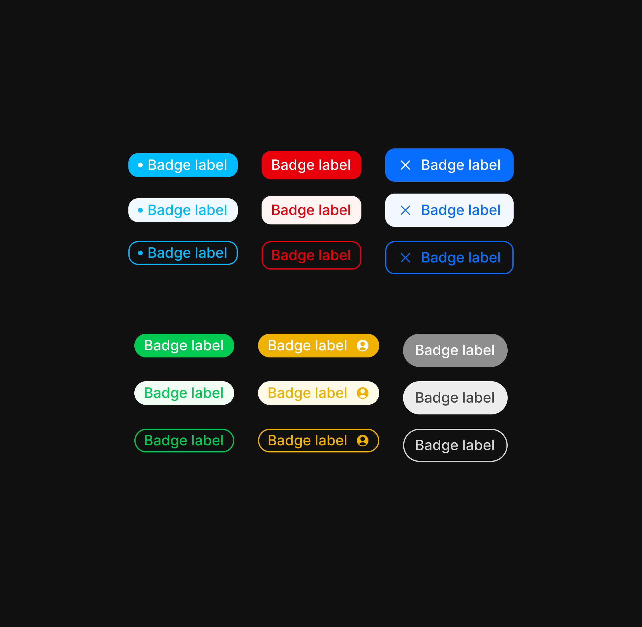
UI library | Atoms


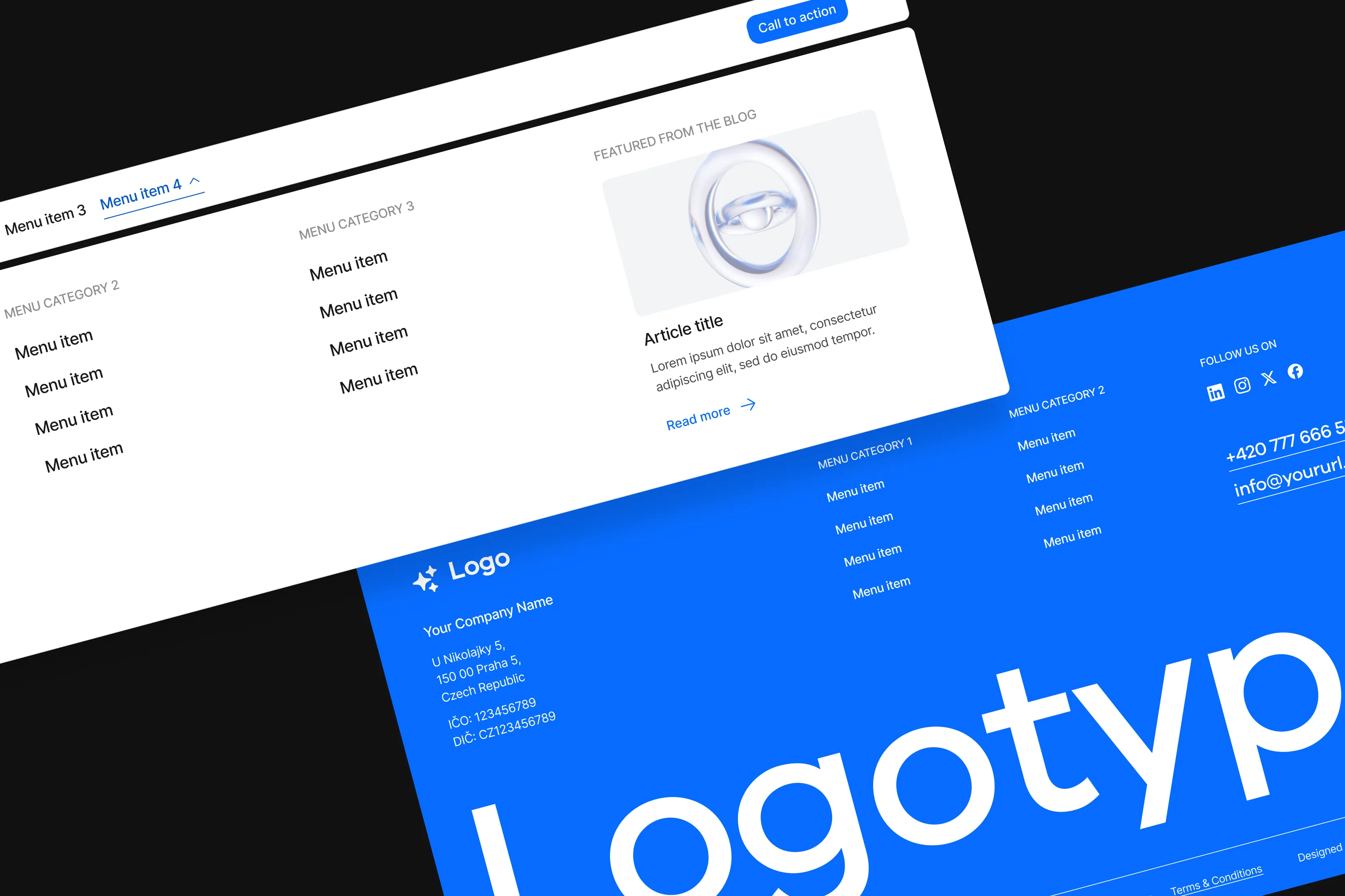
UI library | Molecules & Organisms
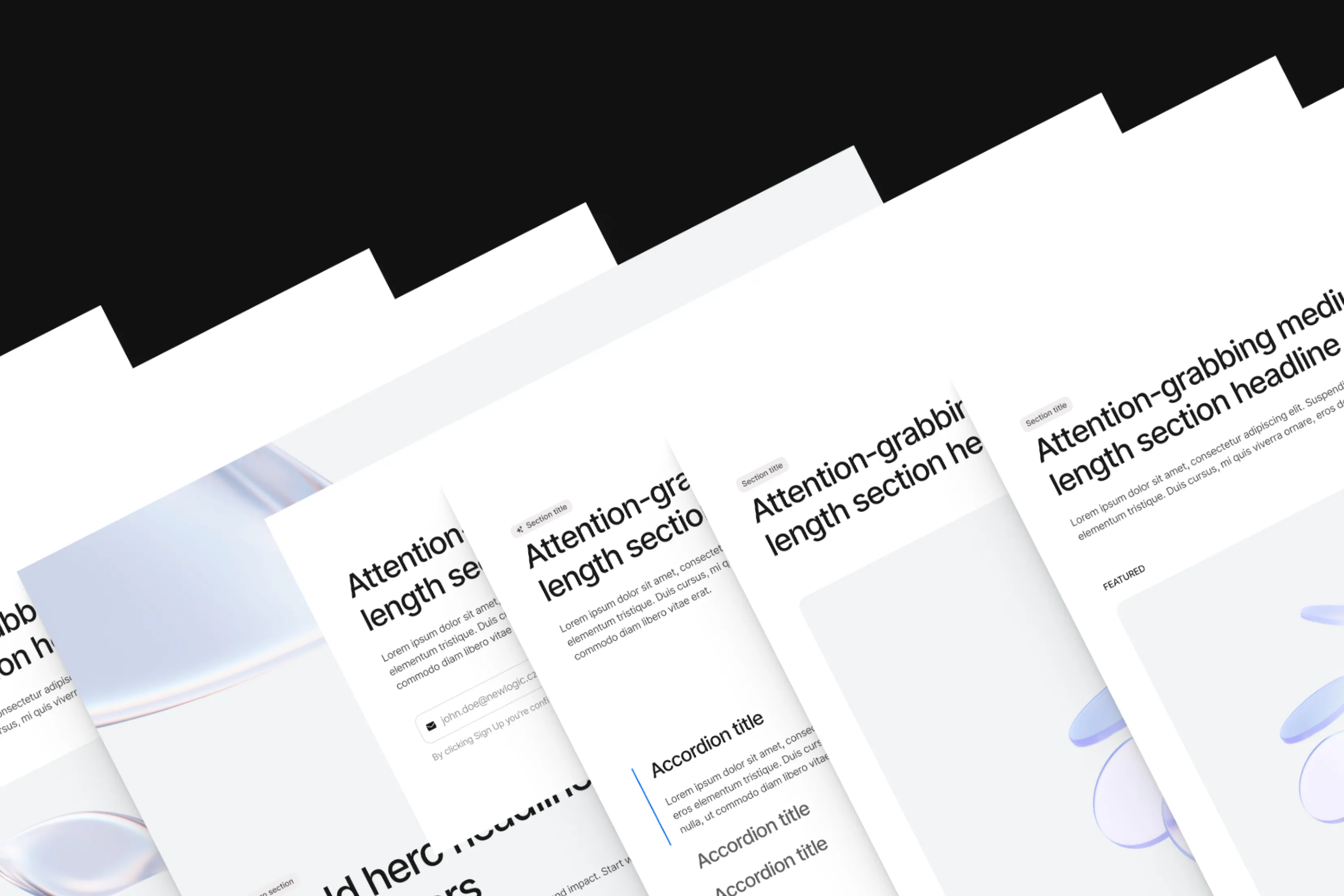
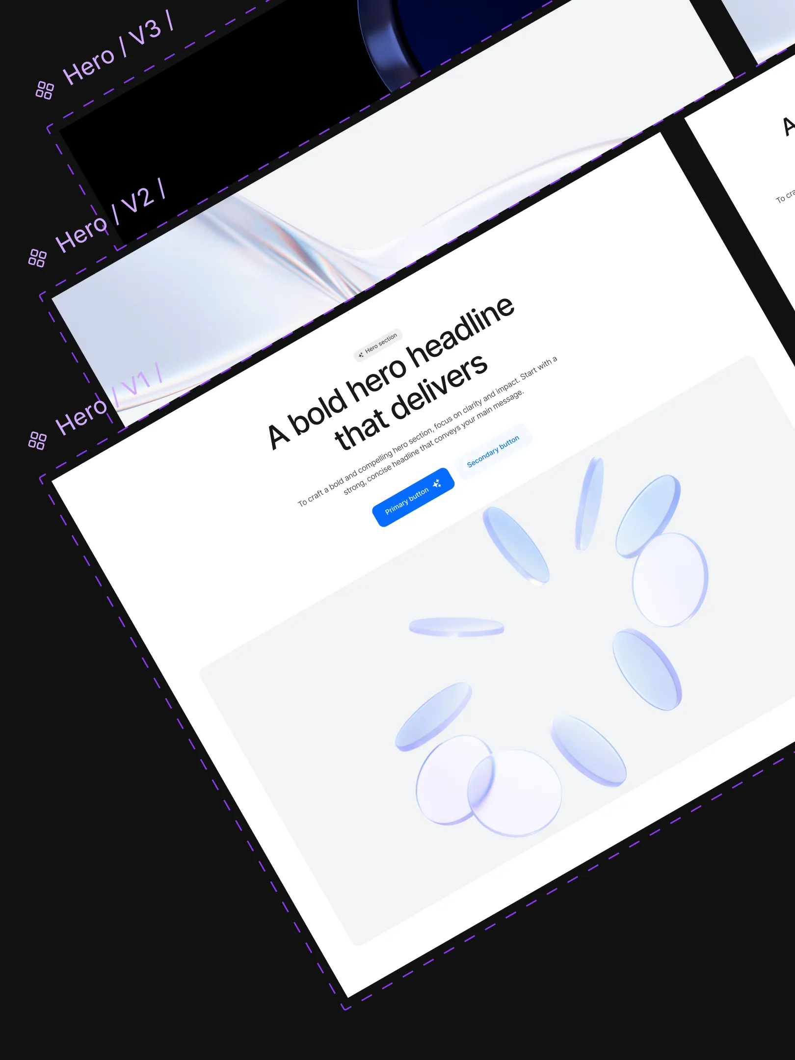
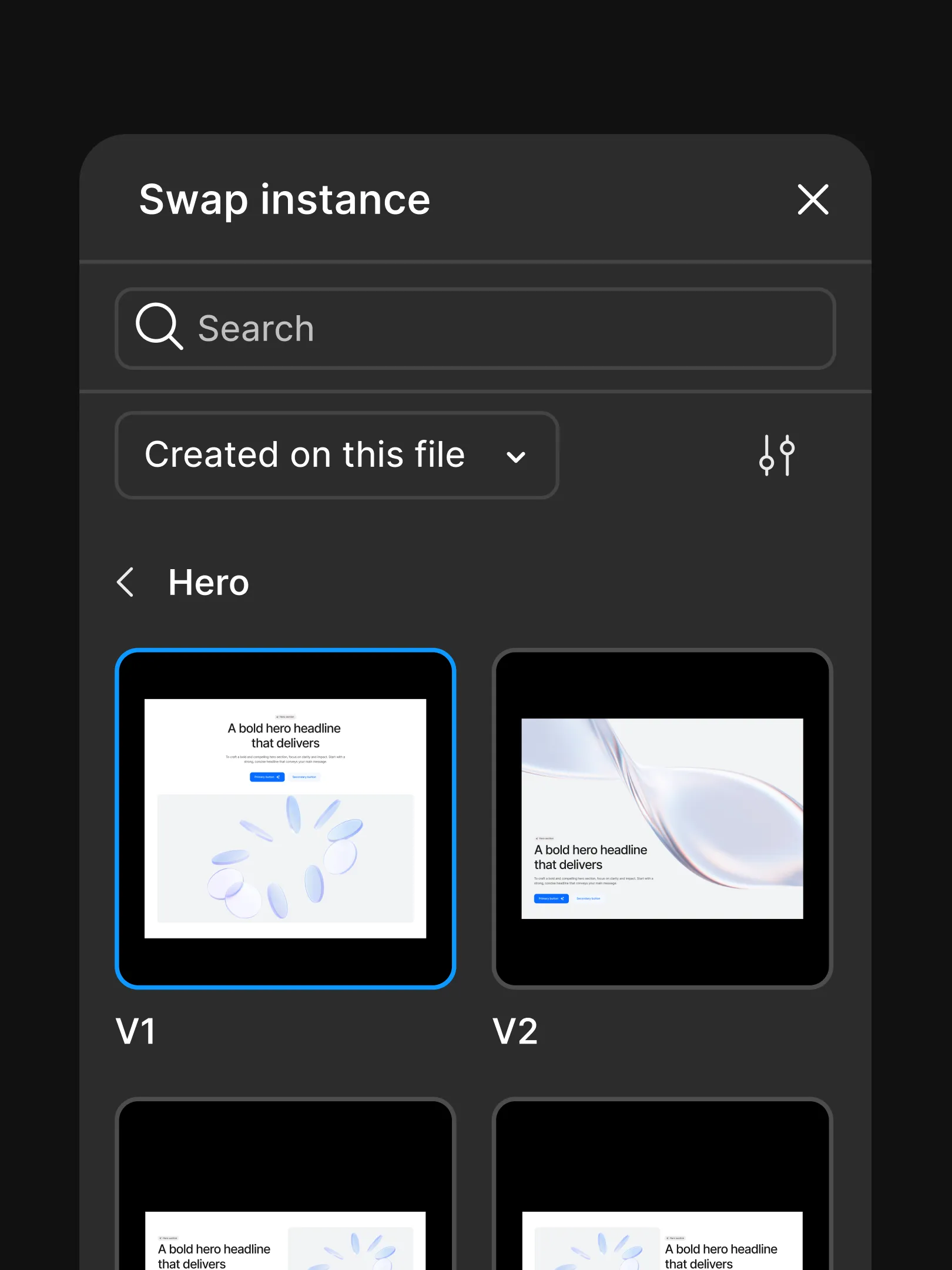
Upon finalising the atom-level elements, I moved on to expanding the system by designing molecules and organisms that translated atomic elements into scalable, real-world UI patterns. These higher-level components established consistent structures for complex interfaces, enabling faster design, easier reuse, and reliable application across projects.
The resulting UI library serves as a shared foundation for both design and delivery. Designers can use it to quickly kick off new projects with a consistent, production-ready base, while also enabling smaller-scale projects to be built directly using Figma Sites by importing the same design system and components. This dual use bridges design and no-code delivery, increasing speed, consistency, and flexibility across different project scopes.

Conclusion
Project overview
Team
1 Lead product Designer
1 Chief technical officer
1 art director/project manager
Year
2025
Stack

