Project Overview
Landing Pages, Ad Creatives, Website
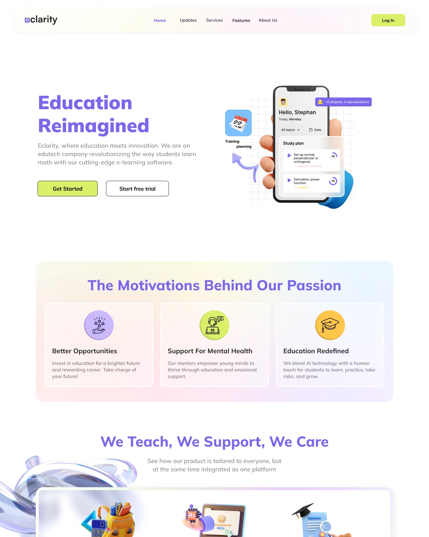
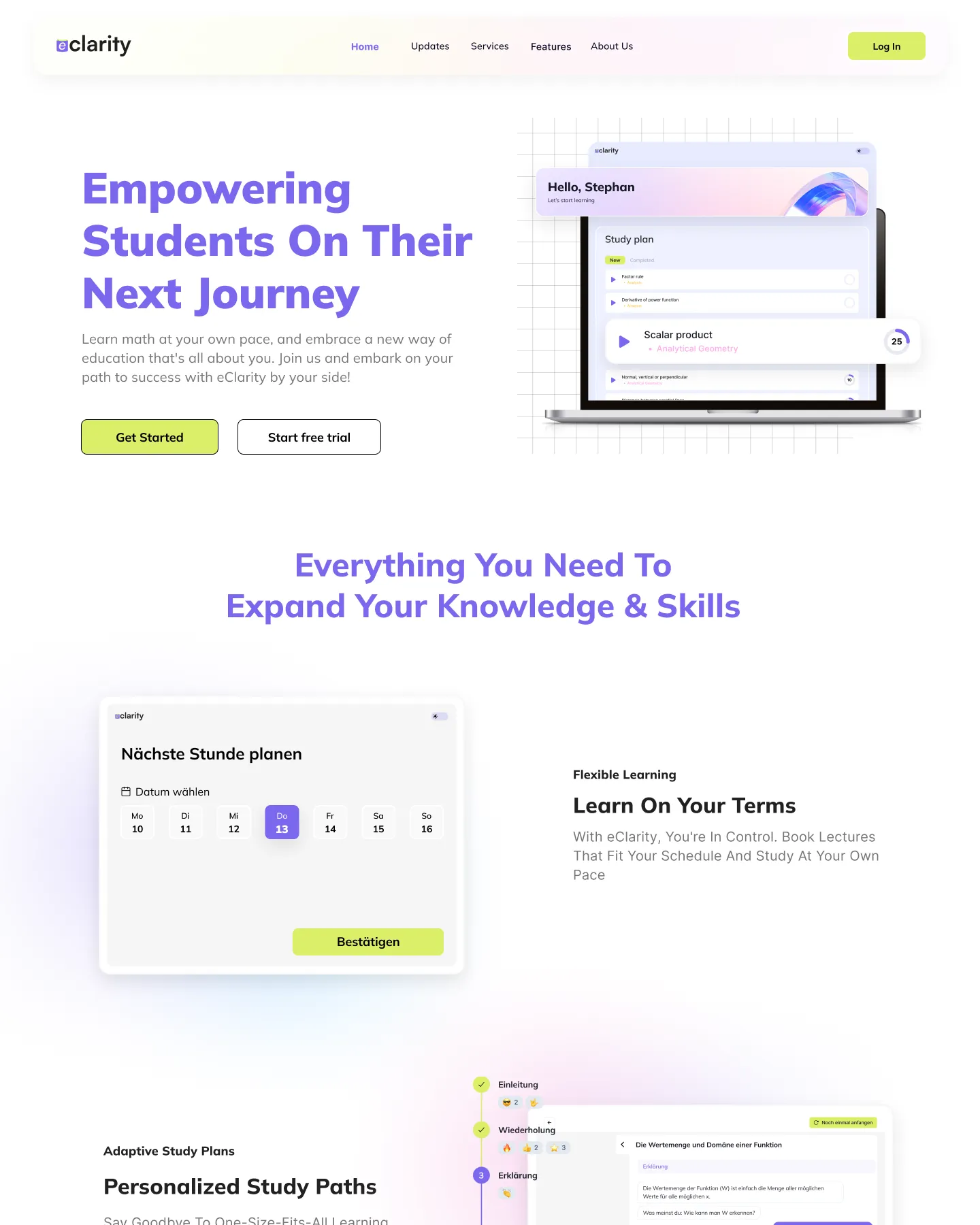
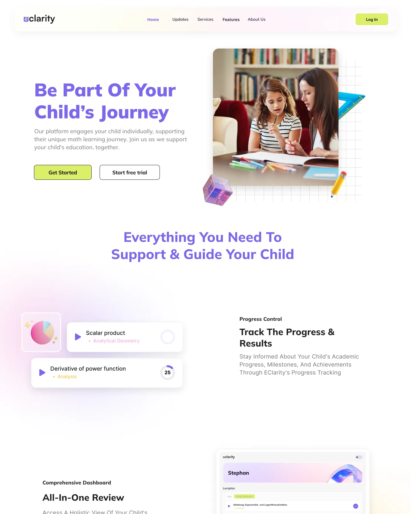
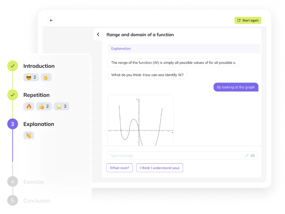
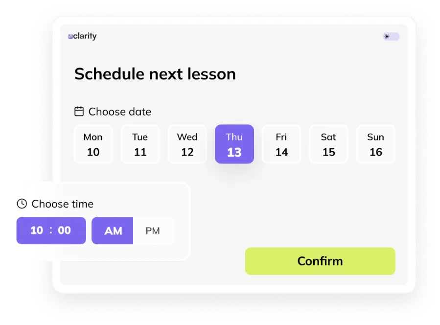
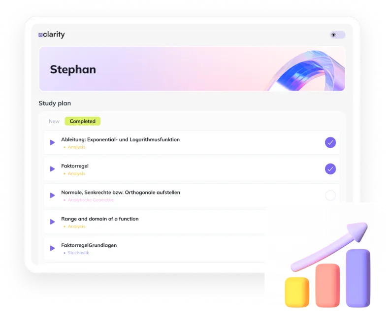
Eclarity is at the forefront of educational innovation, blending technology with personalized learning experiences. By harnessing cutting-edge technology, Eclarity aims to empower students and educators alike, fostering a dynamic and interactive learning environment.
In collaboration with Eclarity, our project aimed to ascertain market demand for their cutting-edge e-learning software prior to its formal development and launch, and to design and build a company website showcasing its vision, mission and the product.
The Problem
Uncertainty and No Tangible Products
The Solution
Establishing Eclarity's Digital Presence
Ideation & Wireframing
Molding Eclarity’s Vision & Structure
The ideation and wireframing phase mark the inception of design and development efforts for the landing pages and the final corporate website. This phase involves competitor analysis and brainstorming sessions, where ideas are refined, consolidated, and translated into wireframes, which serve as skeletal representations of the final products’ layout and functionality.
Pre-launch Customer Journey Structure
Information Architecture of the Company Website
hero
brand
intro
main problems
that we solve
Product
features
cTA
Footer
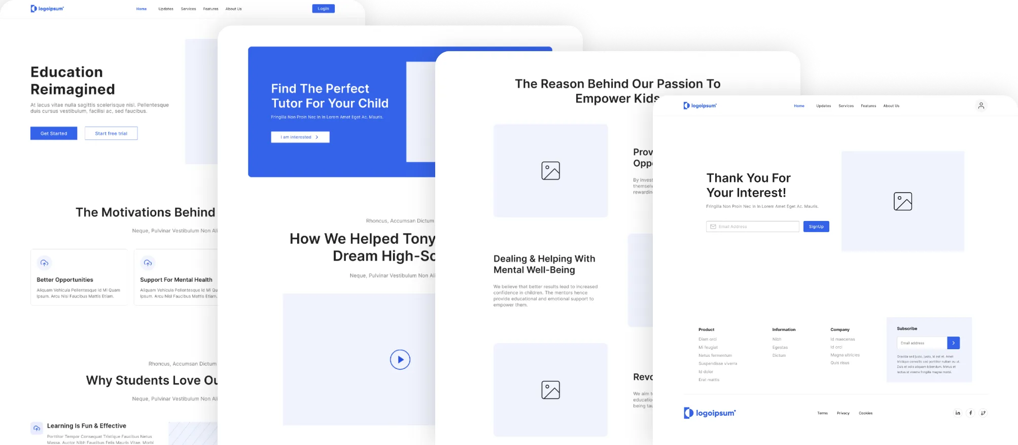
Wireframes
Visual Design
Minimalistic Yet Approachable
In close collaboration with the founder, marketing lead, design lead and graphic designer, our primary objective was to develop a visually captivating and unified UI that enhances user engagement and simplifies navigation.
Through thoughtful selection of colors, typography, imagery, and graphical elements, we aimed to convey Eclarity's brand identity and values while prioritizing user-centric design principles.
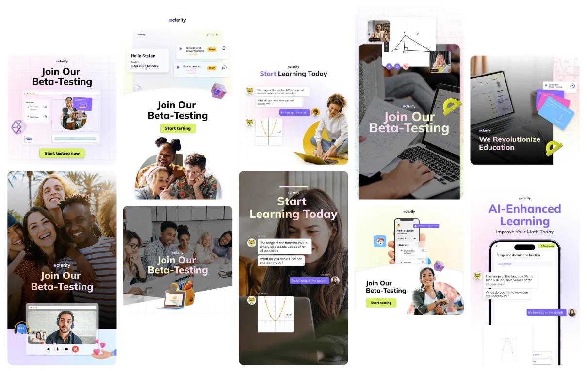
Additionally, ad creatives have been produced to drive lead generation campaign initiatives by leading the target audience towards the landing pages.
Interface Design Process
Initial Interface Design
Typeface
Headings
Body Text
Eclarity's chosen typeface, Mulish, strikes a balance between modernity and readability, ensuring that content is easily comprehensible and visually appealing.
Color Palette
Vibrant yet harmonious colors are chosen to stimulate interest and a positive learning environment, while maintaining accessibility and readability for all users.
Motion Graphics Assets
Visual Assets
Final Designs & Dev
Bringing Vision to Reality
All the designs, from landing pages to the final company website, have undergone a strict iterative design process. Each stage involved meticulous refinement and feedback integration to ensure alignment with project goals and user expectations.
Once the final designs for each landing page and the final company website have all been approved of, I moved on to their development. Throughout the development process, testing was conducted among myself and other team members to detect and resolve any usability concerns and enhance the overall user experience.
Desktop Design
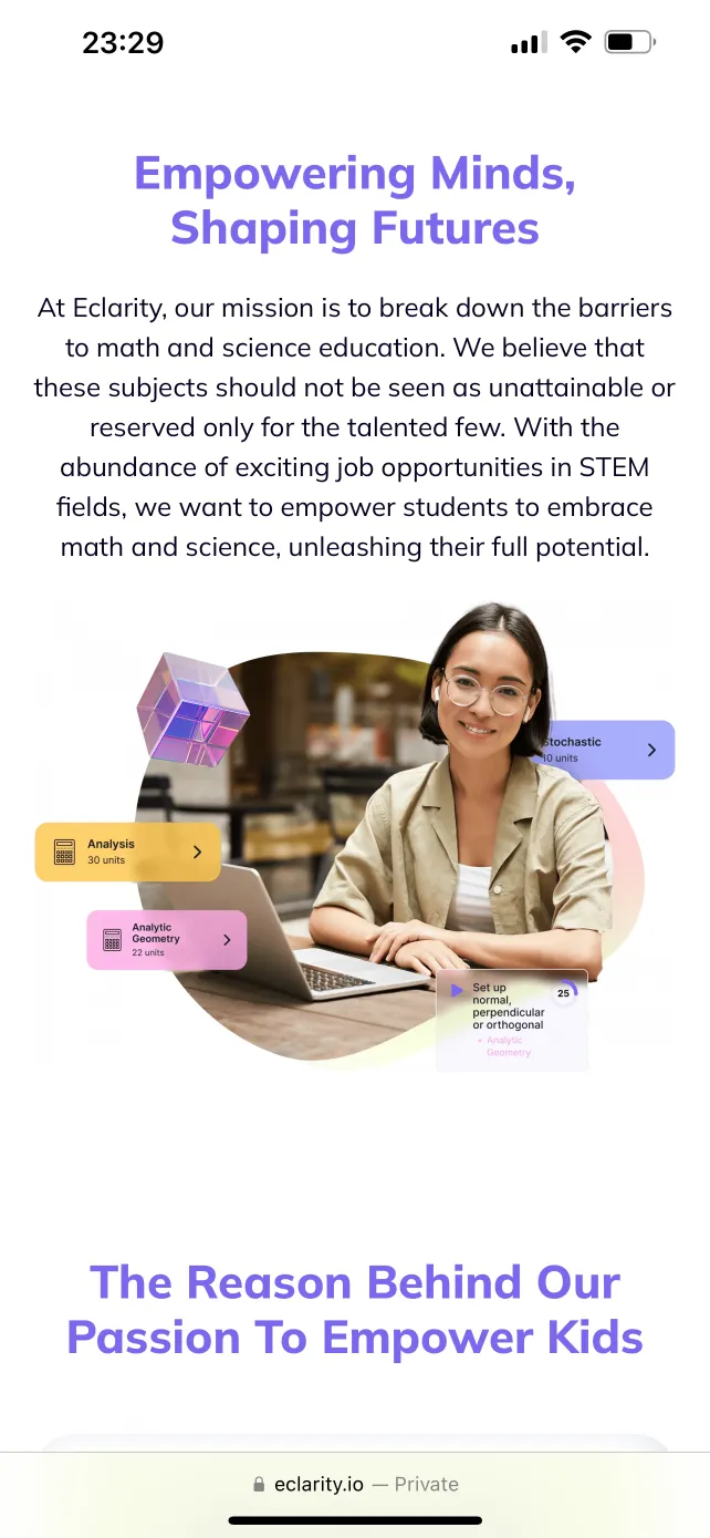
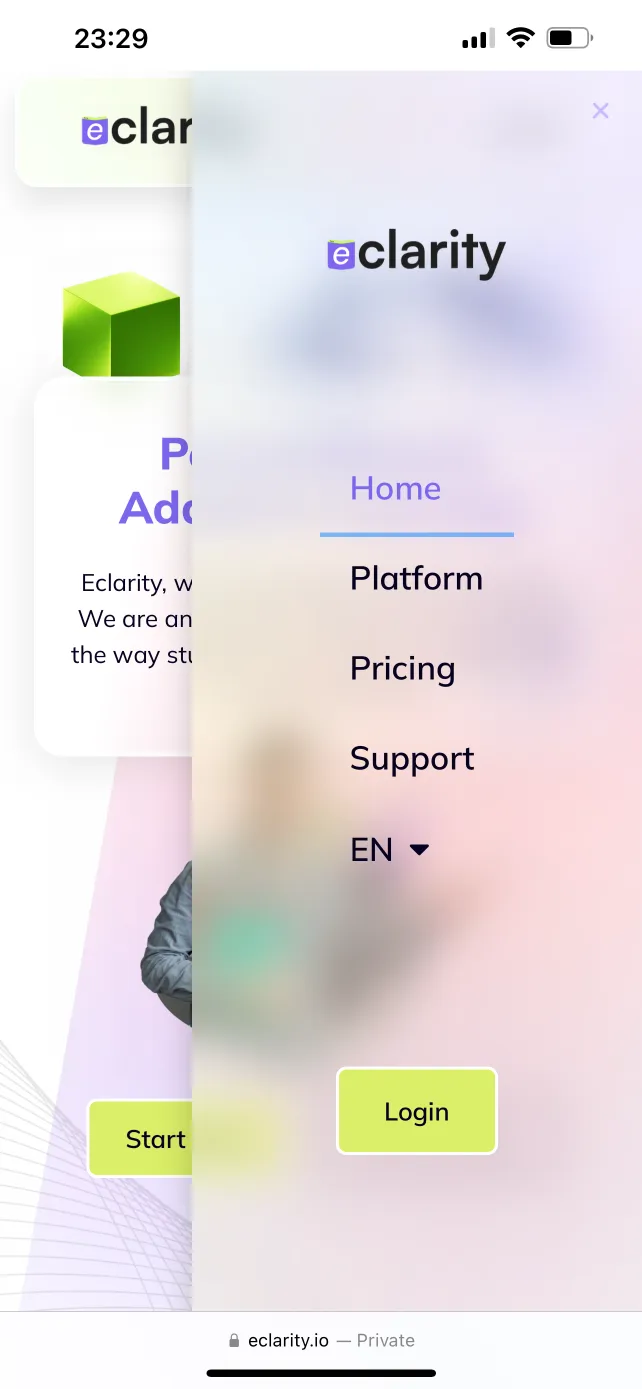
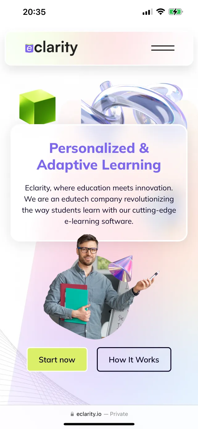
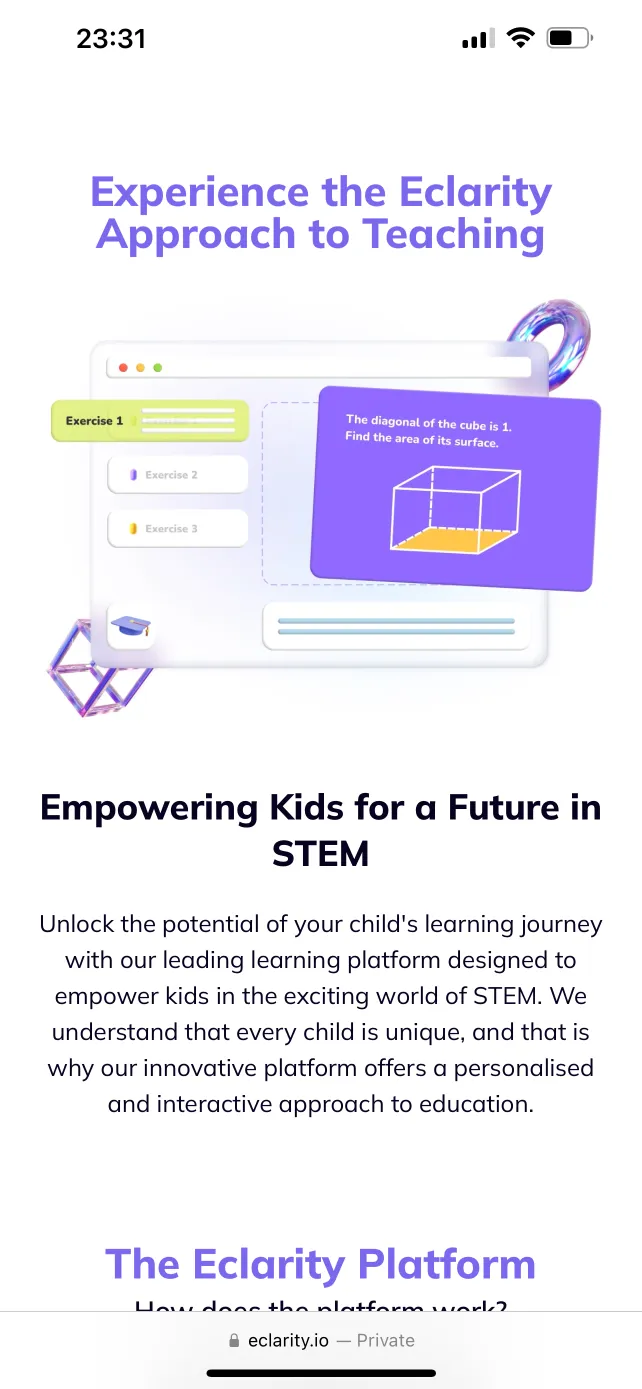
Mobile Responsive Design
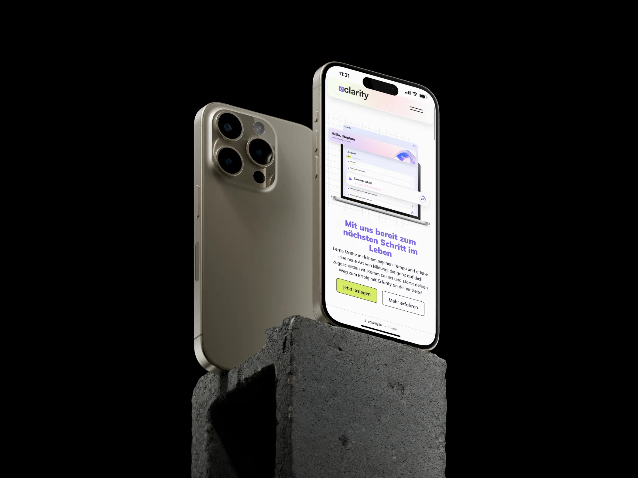
Mobile Screens
Conclusion
Looking Back, Moving Forward
In conclusion, I take great pride in the project and the positive outcomes it has yielded. Our collaborative efforts have been fundamental in establishing Eclarity's digital presence. However, as much as I am proud of this project, I am also aware of the areas where I could have improved.
Key Project Takeaways
Iterative Improvement
Embracing an iterative approach allows us to continuously refine and enhance our solutions based on feedback and insights gathered throughout the project.
Cross-functional Collaboration
Collaboration among cross-functional teams is crucial for success. By leveraging the diverse expertise and perspectives of team members, we can tackle challenges more effectively and achieve better outcomes.
In-depth User Research
More comprehensive user research through surveys or interviews would have given us deeper insights into the user experience. Implementing these insights into the designs could have led to better results.
Thank You!
While you are still here, why not have a look at my other projects?

